 |
| AJAYI GBEMISOLA |
WHAT IS A DASH BOARD
A dashboard is a visual display of key information, usually in the form of graphs, charts, and widgets, design to provide a quick overview of data relevant to a particular goal or business process. It’s like a control panel for monitoring and managing various aspects of a system or organizations.
STEPS NEEDED IN CREATING A DASHBOARD?
1. Define objectives: Determine the purpose of the dashboard and what key metrics or information it should display
2. Gather data: Collect the necessary data from various source such as data base, spreadsheet, e.t.c
3. Clean and process data: Prepare the data for visualization by cleaning it, transforming it, and aggregating it as needed.
4. Choose visualization tools: Select the appropriate tools and software for creating the dashboard such as excel, table, powerBI, or custom coding.
5. Design layout: Plan the layout of dashboard, deciding which charts, graphs, tables, and other element will be included and how they will be arranged.
6. Create visualization: Develop the individual visualizations based on the chosen layout or data, ensuring they effectively communicate the intended information.
7. Add interactivity: Enhance the dashboard with interactive features like filters, drill-downs, to allow users t explore the data more deeply. Test and iterate: Review the dashboard for accuracy, usability, and effectiveness, making any necessary adjustments based on feedback or testing
8. Deploy: Publish or deploy the dashboard to the intended audience, whether it’s through a web portal, a standalone application or integrated within existing systems.
9. Maintain and update: Regularly maintain and update the dashboard to ensure it remains relevant and continues to provide value over time. This may involve adding new data sources, adjusting and visualizations or incorporating feedback from users.
HOW WE CAN CREATE A DASHBOARD (STEP BY STEP GUIDE)
When creating a dashboard, we need three (3) sheets on excel and that is:
1. DATASET
2. PIVOT TABLE
3. DASHBOARD
NOTE: This is the data set we will be working with.
Step2: Turn the data set into table
NOTE: Highlight your data set, go to insert, click on table to turn your data set to a tabular form.
This is how our data looks like when we turned it to table
STEP3: Go to insert and click under pivot table and click on new work sheet
This is what you should be
seeing if you are doing it right.
It will automatically take you
to this pivot sheet and you can rename your sheet as “PIVOT”
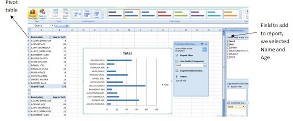
STEP 4 : After we open our pivot sheet, we select or choose
field to add to report, then it gives us the pivot table and we copy and paste
under because we are still going to be using it. Highlight, go to option under
pivot tools and click on pivot chart. Select any chart you want to use and
click on OK. It will automatically bring out your chart
This is the first chart, to determine the next chart, we highlighted our pivot table again, paste it under as shown on the table above then we move to change my” field to add to add to report” and we selected STATE AND TOTAL NUMBER IN STATE so as to help us present it in a chart then again we highlight, under PIVOT TOOL we go to option then select pivot chart. Then again you select any chart you want. Below is the representation of what we are talking about.
This is how our dashboard
looks like, presentation of our two charts under the same sheet. If you notice,
you can tell that the heading of the first chart is different from the second,
the reason is because we have edited the first one and to edit the second, we
click on the” TOTAL” and edit it to whatsoever heading we want
 CONCLUSION:
There are few things I want us to observe from our dashboard, if you are not
conversant with the table, you might not understand the chart and that’s why we
can as well label our axis for better understanding
CONCLUSION:
There are few things I want us to observe from our dashboard, if you are not
conversant with the table, you might not understand the chart and that’s why we
can as well label our axis for better understandingAs
clearly shown with the aid of the arrow, we can see that our chart as been
properly labelled and it can now be easily understood by anyone even without
seeing the table. To insert the axis, you go to layout under your pivot tools,
click on axis title then for vertical, you select primary vertical axis title
then you get options of how you want your vertical title to be presented. You
can go ahead and repeat for the horizontal axis just that under your axis
title, you select primary horizontal axis to label your horizontal data.
NOTE:
The census dashboard provides a comprehensive overview of the country’s
population, name of citizens, age of each citizen and total number of each
citizen in the state.


0 comments:
Post a Comment